Design through the Decades | The 1960’s
The 1950s was an era of newfound American Dream innocence, and what followed was a shattering of that naivety. Graphic design in the 1960s emerged after the brutality of the Southeast Asia wars, an increasing racial divide, and the rebellion of the youth against the cultural norms. Sex, drugs, and rock and roll dominated the scene, and the art and design of era reflected these changes. From the geometric layouts and clean and prim forms of the 1950s, graphic design in the 1960s evolved to incorporate asymmetrical experiential styles and messy grunge abstracts.
Design Purpose
The '60s is best characterised as the decade of America’s psychedelic movement. Experiments with mind-altering drugs were common, and these LSD-inspired distorted sensations were highlighted in rock concert posters to reflect the trippy experiences. During this time, teenagers were also rebelling and turning away from the conventions of the past decade.
It was a time to question social, cultural, and political norms. The youths shunned the materialistic and conservative beliefs and practices entrenched in society. Many movements emerged, and all of them were mirrored in the graphic design of that time. The Black movement, the feminist movement, and the youth movement all sought to create an egalitarian society free from discrimination. They all represented themselves in posters, flyers, and the like to shake the lingering “peace” that the older generations wanted to cling on to so desperately. However, the reality was that times have changed, and there were impending counter-culture revolutions.
Milton Glaser, Dylan, 1966 | Poster design for Bob Dylan
Design Style
The psychedelic movement of the 1960s was not only observed in the prevailing music taste during that time but also in many aspects of popular culture like fashion, language, art, literature, and philosophy. Visuals during this time included Art Nouveau-inspired curvilinear shapes and illegible hand-drawn type letters. There were also intense optical color vibrations inspired by the pop art movement.
Practices such as materialism, discrimination, and capitalism were avoided while environmentalism, Eastern mysticism, and music festivals were embraced. Many would agree that graphic design in the 1960s was widely-used and seen in the festivals and concerts that happened.
The geometric layouts of the ‘50s filled with straight lines and angles were replaced by dizzying optical illusions with repeating patterns. Known today as “Optical Art,” this abstract style aimed to show the mind-altering perceptions that defined the 60s. Pop art also emerged and evolved with Andy Warhol. It was an ironic homage to materialism and consumer culture and served as a kind of protest art against the rising elitist impressionism of art culture. It ultimately served to bridge the divide between high-end art and contemporary culture.
Influentical People
In a sense, the 1960s was a revolution in graphic design. Like in the 1950s, you still have Saul Bass and Paul Rand creating posters and modifying logos, but a lot of changes were happening in their design as well. Alan Fletcher and Erik Nitsche became famous for their branding campaigns, and Keiichi Tanaami delved into animation, lithograph, illustration, and editorial design.
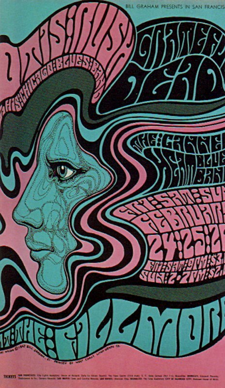
May 6-7 1966 Artist Wes Wilson
Jefferson Airplane, The Yay Walkers at Fillmore Auditorium, SF
There was a distinct contrast in the styles of the graphic designers of the ‘60s. Some have held onto the clean and prim style of the 1950s while others moved into the trend of the ‘60s and experimented with their design. Here are other influential people that dominated the decade.
Wes Wilson
He is one of the most famous graphic designers of the 1960s era. In fact, his style is now synonymous with the “psychedelia” that characterised the decade. He is the one who popularised the well-known typeface that looked as if it was wobbling or melting off the poster. You’ve probably seen one of his designs, and it is designed as such to reflect the mind-melting sensations of psychedelic drugs.
Victor Moscoso
He was the one who popularised vibrating neon colour schemes to get that “psychedelic effect.” He experimented with his works by clashing together colours from the opposite sides of the colour wheel to create eye-intensive images.
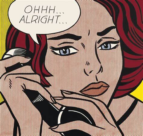
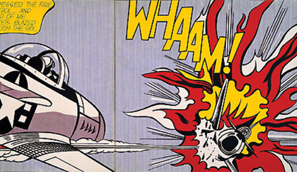
Roy Lichtenstein
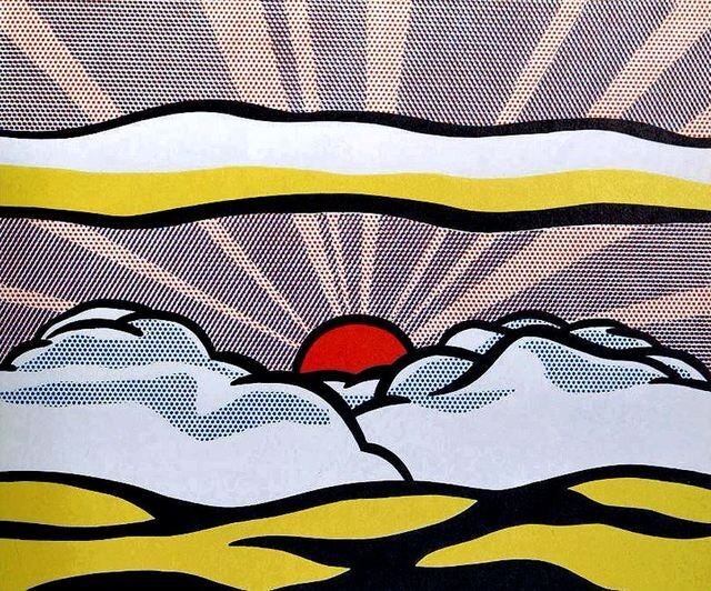
His paintings are famous for their comic book style vibe. They had chromatic colour schemes, thought bubbles, bold outlines, and repetitive dot stencils. However, instead of magazine-sized canvases like how a comic book looks like, he used large, billboard-sized canvases for his art.
Andy Warhol
'Black Bean', Andy Warhol, 1968
Andy Warhol is probably one of the famous pop artists that thrived during the 1960s. His works are popular, along with Lichtenstein. As an artist, he aimed to bridge the gap between pop culture and the bourgeoisie. He did this by combining commercial and literary art in his work. Part of his masterpieces includes the iconic Coca Cola bottles and Campbell’s soup cans. They’re still well-known and still studied to this day not only for their cultural significance but also for their incredible influence on graphic design.

